

Come to the dark side.
The dark side has Google Chrome, Safari, Mozilla Firefox or Microsoft’s Edge browser, the temptation is clearly strong.
If that’s not enough, Twitter, Reddit, YouTube, Google maps, Outlook, Facebook’s Messenger and Gmail all have dark themes. Last year Apple introduced the Mojave OS as well as key features of iOS 13. (This design announcement received more applause at Apple's Worldwide Developer Conference than anything else for their new iOS.)
Google and Apple have updated all their design practice guidelines (Google’s Material Design and Apple’s Human Interface Design) to work with dark mode (and most of their apps too), including accessibility guidelines and other design tools.
Here are some examples of recent version releases by Apple and Google products:
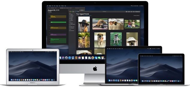
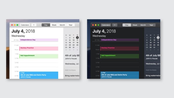
Apple’s latest products all with a dark mode interface.
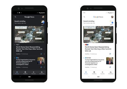
Google’s latest app designs.

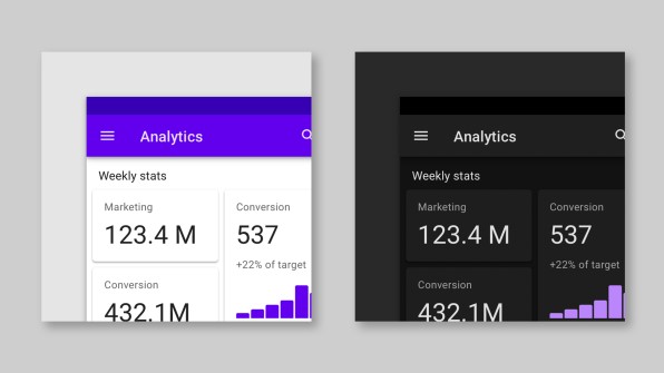
Dark mode for business and technology platforms.
Example of the Material Design guide for dark themes. [Image: Google]
Apple’s Human Interface Design guidelines for iOS Dark Mode. [Image: Apple]
In the Dark and Lovin’ It
Like all the major industry influencers mentioned above, at Deep Instinct we also weighed up the value of dark versus light mode for our products. The decision to go with dark mode was partially based on the developing trend, but also the result of considerable thought on how dark mode will resonate with our users, both consciously and at an unconscious level.
At the conscious level, the dark mode has its functional value, wherein some user contexts dark mode can be particularly useful. According to Apple’s human interface guidelines, dark mode allows the “content to stand out while the surrounding UI recedes into the background.” For this same reason, dark mode works well when the user needs to quickly scan stats and focus on key data points, such as when referencing charts or graphs.
A Salesforce study suggested that there may be some functional benefits when it comes to reading charts and graphics. After asking study participants to compare charts in both light and dark themes, they were then asked which would be “worth the least or most if they had to pay for each type.” The Salesforce team found that respondents would pay more for the dark theme compared to a light one. They found the dark interface more conducive to making decisions faster, and just as accurately.
Interestingly, the claim that dark mode relieves eye strain, improves focus and productivity, is still inconclusive. Although dark mode has often been billed as an accessibility feature for decades in digital products, there is no conclusive study that confirms this assertion.
At the unconscious level, color has the power to influence our psychological responses; where black implies authority, power, and control. Applying dark shades to a physical or digital product sends a subtle message that the product is powerful, authoritative, luxurious, elegant and sophisticated, and sometimes also, mysterious.
Keeping Focus on Our Customer’s Focus
Security staff – The users who interact with the management console tend to have a very high technical background. Most technical users including developers and security experts tend to prefer working with a dark theme background (check out how most terminals look on security platforms). The dark theme helps them to focus on critical information at any point. Our objective was to make the workload of security professionals easier to manage with a platform that could offer a very intuitive experience. This becomes a major challenge due to the range and complexity of the product’s abilities. As it turns out, making the complex simple can be deceptively complex.
Enterprise end-users – These users who interact with the ‘D-Client’ the agent installed on devices, have only minimal interaction with the product and may not necessarily have any technical background. In this case, the dark theme provides a sense of the solution’s power to protect, in all circumstances. The primary objective here was to make the product aesthetically pleasing to enhance user satisfaction.
An Agile Process: From Plan to Product
The selection of dark theme for our product was a calculated decision that we intend to continue testing and iterate as our knowledge of how we meet our customer’s needs expands and develops. Our major priority as a user-facing product is to minimize our end-users pressures by easing their decision-making process. Considering that most organizations have hundreds of threats thrown at them daily, threat analysts need to rapidly scan a lot of information, while identifying critical data that needs to be acted upon.
The Dark Side Has Proven Hard to Resist
Certainly, the preferred choice of Darth Vader, it appears dark mode has become all too irresistible for most of us as well.
Although the benefits of dark mode versus light mode continue to be debated, a general rule of thumb, particularly for content-heavy websites, is that dark mode works well when you want to encourage the reader to quickly scan stats and focus on key data points, like when looking at charts, or graphs. Likewise, darker colors also support the subtle message of the product being powerful, elegant and sophisticated.
For Deep Instinct’s products, the selection of dark mode was part of a thorough and calculated process, where the guiding insight of Obi-Wan Kenobi was our target audience of end-users.